About this prompt
What this prompt creates
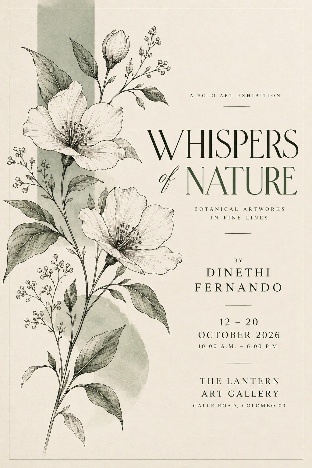
This prompt creates a refined art-exhibition poster with minimal botanical illustration and clean typography. Warm ivory paper, charcoal linework and muted sage accent blocks give the design a calm, gallery-ready feel. Flat print-style artwork, crisp thin strokes and the absence of glossy effects help the poster feel elegant, tactile and contemporary. The 2:3 composition works especially well for exhibition posters, so review the crop before switching to another format.
Tips for the best result
Replace all bracketed placeholders with the final event wording before using the prompt.
Double-check the artist name, gallery name, dates and any prices separately before generation.
Keep the main headline short and easy to read.
If very small text becomes unclear, add it later in a design editor.
If the botanical drawing becomes too faint at thumbnail size, ask for slightly thicker linework.
Check the first result carefully for spelling, edge quality, clean alignment and unwanted elements.
Variations to try
Try a single fern leaf with charcoal typography and no coloured accent blocks.
Use a cooler off-white paper tone for a more contemporary gallery look.
Keep the same composition but reduce the botanical detail for a more minimal result.
Change one instruction at a time so you can clearly compare how the palette, linework or layout affects the design.
Where to use it
This concept works well for gallery announcements, art fairs, exhibition invitations and minimal poster collections. Keep an uncropped master version and create separate exports for social media or print. Review small text, thin lines and fine botanical detail at the final display size, since a good thumbnail does not always guarantee that every detail is fully usable.