Skip to content
Education
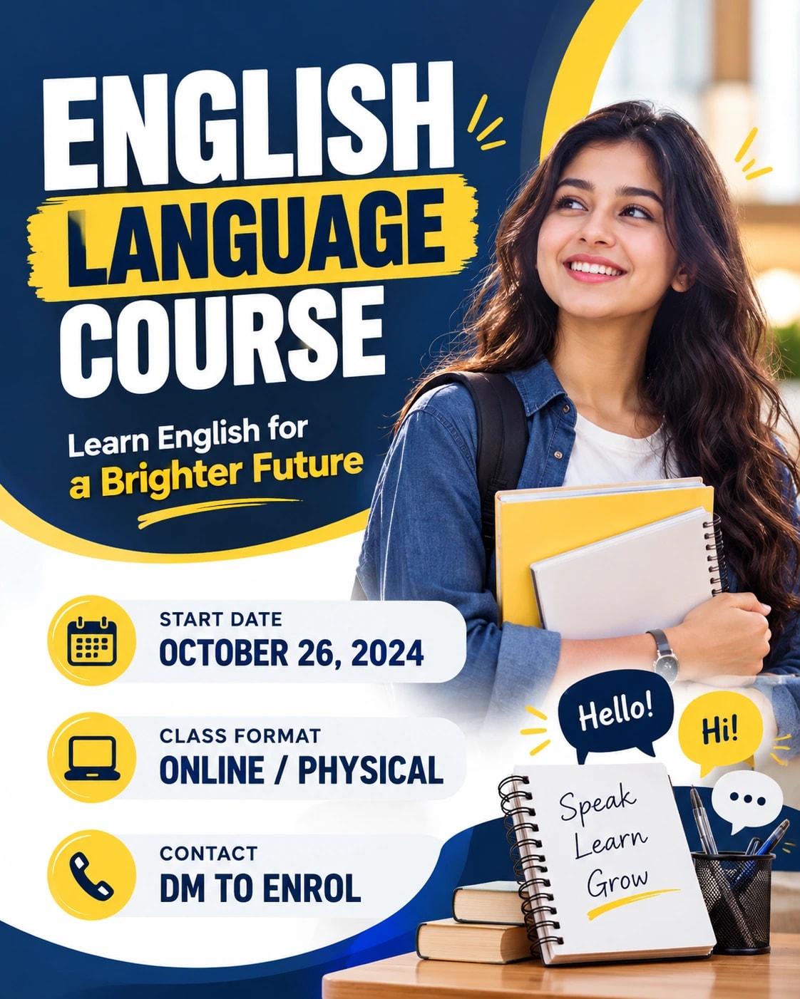
Language Course Enrolment Social Ad – AI photo made with ChatGPTMade with ChatGPT

Language Course Enrolment Social Ad

A focused course-registration post with a clear title and class information.

PROMPT

Use my supplied product, logo or approved sample-image references wherever requested. Preserve the actual product design, logo geometry and any people within supplied photographs. Use my provided advertising copy and offer details exactly; do not invent claims, prices, testimonials or contact information. Create a polished visual design in a vertical 4:5 aspect ratio, following this specific concept: Language Course Enrolment Social Ad. Composition and Pose Build a vertical ad with a large [COURSE NAME] heading, a short [COURSE BENEFIT] beneath and three separated information lines for [START DATE], [CLASS FORMAT] and [CONTACT]. Add an original small notebook-and-speech-bubble illustration at the lower right. Keep text dominant and avoid invented success rates or testimonials. Clothing, Materials and Styling Navy, white and bright yellow accents with bold clean sans-serif type. Background and Lighting Flat crisp design, consistent alignment and generous margins around every text block. Layout and Content Accuracy — Highest Priority Keep the requested object arrangement and text hierarchy clear. Use only supplied names, dates, prices, locations and wording in text-based designs. Leave caption areas blank when requested. Preserve supplied product and logo details. Keep key information inside safe margins, with adequate contrast against its background. Do not add unsupported claims, invented brands, extra decorative paragraphs, watermarks or unrelated elements. Ensure the composition remains understandable at a small preview size. Quality and Finish Maintain clear focal separation, natural scale, correct perspective and consistent illumination throughout the image. Keep anatomy and object construction believable. Render the main subject sharply while allowing only the intended background softness. Preserve subtle detail rather than using excessive sharpening or heavy smoothing. Make the overall visual feel cohesive, carefully composed and suitable for the stated use. Avoid: distorted objects, invented branding, altered labels, misspelled supplied copy, unreadable main text, cluttered composition, unrealistic reflections, floating contact shadows, watermarks and unrelated props. Keep only the text and people explicitly requested in this composition.

Works withChatGPTGeminiMidjourneyFlux

How to use

  1. 1Open ChatGPT or Gemini and upload your photo.
  2. 2Paste the prompt and send it.
  3. 3Not quite right? Ask for small changes, like “warmer light”.

Get new prompts on WhatsApp

New tested prompts every week, straight to your phone.

Join (opens in a new tab)

How to use

  1. 1Open ChatGPT or Gemini and upload your photo.
  2. 2Paste the prompt and send it.
  3. 3Not quite right? Ask for small changes, like “warmer light”.

Get new prompts on WhatsApp

New tested prompts every week, straight to your phone.

Join (opens in a new tab)

About this prompt

What this prompt creates

This prompt creates a focused course-registration post with a strong title area and clearly organised class information. Navy, white and bright yellow accents give the design a confident educational look, while bold sans-serif typography keeps the key details easy to scan. Consistent alignment, flat graphic styling and generous spacing around each text block help the layout stay clear even when viewed on a phone. The 4:5 format is especially suitable for social media enrolment posts, so review the crop carefully if you adapt it to another size.

Tips for the best result

  • Replace all placeholder text with the final course name, class dates, times, location and registration details before generating the design.

  • Use one specific course benefit rather than several broad claims, so the message stays focused and credible.

  • Keep the main headline short enough to remain readable on mobile screens.

  • Remove decorative icons or secondary graphics if they begin to compete with the class information.

  • If the design includes a tutor or academy logo, upload a clean high-resolution version and keep it separate from the main text area.

  • Proofread all dates, contact details and registration wording before publishing, and add very small text manually in an editor if needed.

Variations to try

  • Try a white-and-green version with one simple notebook illustration for a fresher academic look.

  • Use a darker navy background with white text and a single yellow call-to-action block.

  • Keep the same information structure but reduce decorative elements for a more formal course announcement.

  • Change one element at a time so you can compare how the colour palette, spacing or headline treatment affects readability.

Where to use it

This concept works well for course enrolment posts, academy campaigns, tuition-class announcements and online lesson promotions. Keep a high-resolution master version and create separate exports for Instagram, Facebook, websites or print. Review the title, class details and registration information at the final display size to make sure the post remains easy to read and useful for prospective students.