Skip to content
Restaurant
Plant-Based Lunch Menu Board – AI photo made with ChatGPTMade with ChatGPT

Plant-Based Lunch Menu Board

A bright plant-based menu with simple ingredient drawings and clear prices.

PROMPT

Create an original visual composition using the scene and layout below. Use supplied text exactly where specified. Replace every bracketed placeholder with my final supplied information before generating the design. Keep the artwork independent of existing brands or copyrighted character designs. Create a polished visual design in a landscape 3:1 aspect ratio, following this specific concept: Plant-Based Lunch Menu Board. Composition and Pose Design a landscape menu with [RESTAURANT NAME] at the upper left and three clearly separated meal groups beneath. Use supplied item descriptions and prices only. Place small original vegetable line drawings at the far right, away from text. Leave room for a supplied dietary note without inventing nutrition claims. Clothing, Materials and Styling White, muted green and charcoal with a fresh minimal appearance. Background and Lighting Crisp flat linework, evenly spaced text and high contrast across all price rows. Layout and Content Accuracy — Highest Priority Keep the requested object arrangement and text hierarchy clear. Use only supplied names, dates, prices, locations and wording in text-based designs. Leave caption areas blank when requested. Preserve supplied product and logo details. Keep key information inside safe margins, with adequate contrast against its background. Do not add unsupported claims, invented brands, extra decorative paragraphs, watermarks or unrelated elements. Ensure the composition remains understandable at a small preview size. Quality and Finish Maintain clear focal separation, natural scale, correct perspective and consistent illumination throughout the image. Keep anatomy and object construction believable. Render the main subject sharply while allowing only the intended background softness. Preserve subtle detail rather than using excessive sharpening or heavy smoothing. Make the overall visual feel cohesive, carefully composed and suitable for the stated use. Avoid: distorted objects, invented branding, altered labels, misspelled supplied copy, unreadable main text, cluttered composition, unrealistic reflections, floating contact shadows, watermarks and unrelated props. Keep only the text and people explicitly requested in this composition.

Works withChatGPTGeminiMidjourneyFlux

How to use

  1. 1Open ChatGPT or Gemini and upload your photo.
  2. 2Paste the prompt and send it.
  3. 3Not quite right? Ask for small changes, like “warmer light”.

Get new prompts on WhatsApp

New tested prompts every week, straight to your phone.

Join (opens in a new tab)

How to use

  1. 1Open ChatGPT or Gemini and upload your photo.
  2. 2Paste the prompt and send it.
  3. 3Not quite right? Ask for small changes, like “warmer light”.

Get new prompts on WhatsApp

New tested prompts every week, straight to your phone.

Join (opens in a new tab)

About this prompt

What this prompt creates

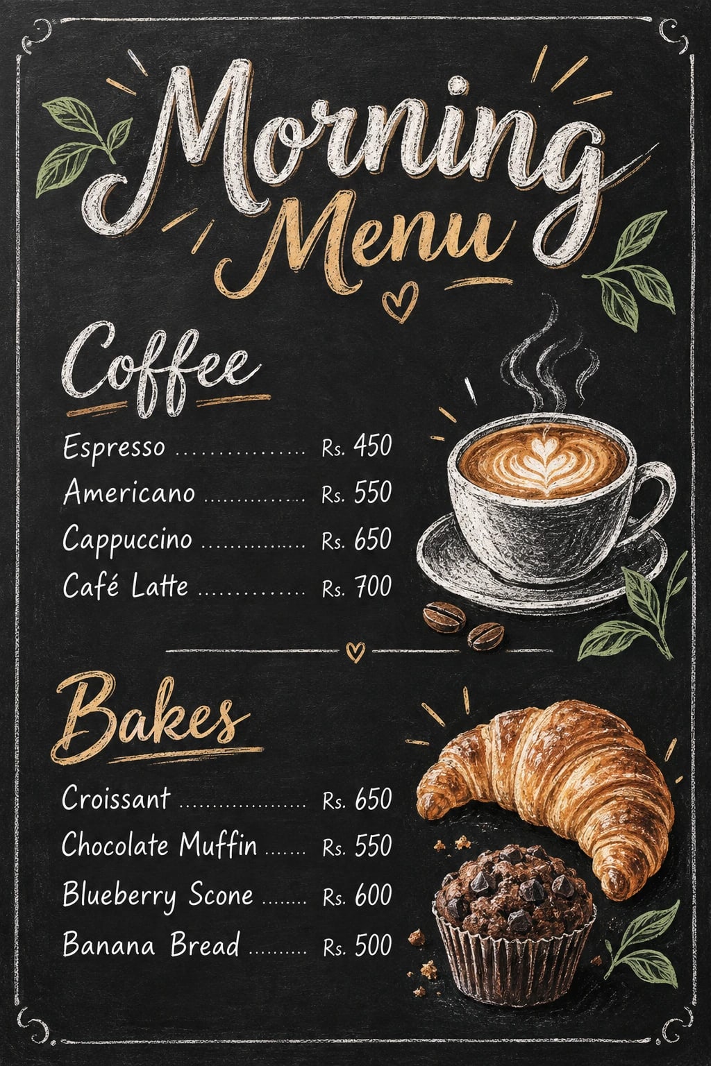
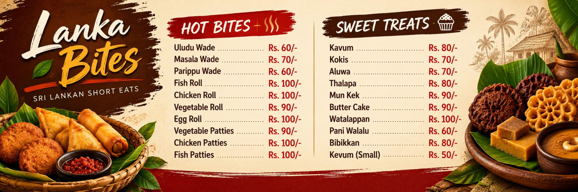
This prompt creates a bright plant-based menu with simple ingredient illustrations, clear item names and easy-to-scan pricing. White, muted green and charcoal give the layout a fresh, natural feel, while crisp linework and consistent spacing keep the design clean rather than decorative. High contrast across each price row helps customers compare options quickly, which is especially useful on wide menu boards. The 3:1 format is well suited to counter displays and digital menu screens, so check the layout carefully before adapting it to another size.

Tips for the best result

  • Replace all placeholder fields with the final menu items, prices and category names before generation.

  • Use verified dietary wording such as “vegan,” “vegetarian,” or “plant-based” only when it accurately describes the item.

  • Keep descriptions short so the board does not become dense or difficult to scan.

  • Use consistent price formatting and spacing across every row.

  • Keep ingredient drawings simple and secondary to the text, especially around longer item names.

  • Add very small notes later in a design editor if generated text becomes unclear.

  • Proofread item names, dietary labels and prices carefully before publishing or printing.

Variations to try

  • Try a warm beige background with forest-green headings and fewer ingredient illustrations.

  • Use a white-and-sage palette with stronger category dividers for a cleaner café look.

  • Keep the same structure but remove most decorative drawings for a more minimal digital menu.

  • Change one element at a time so you can clearly compare how the palette, spacing or illustration density affects readability.

Where to use it

This concept works well for lunch cafés, plant-based restaurants, healthy-food counters and digital menu displays. Keep a high-resolution master version and create separate exports for printed boards, TV screens or social media. Review item names, dietary labels and prices at the actual viewing distance to make sure the menu remains clear, accurate and easy to use.
More like this

More in Menus →