About this prompt
What this prompt creates
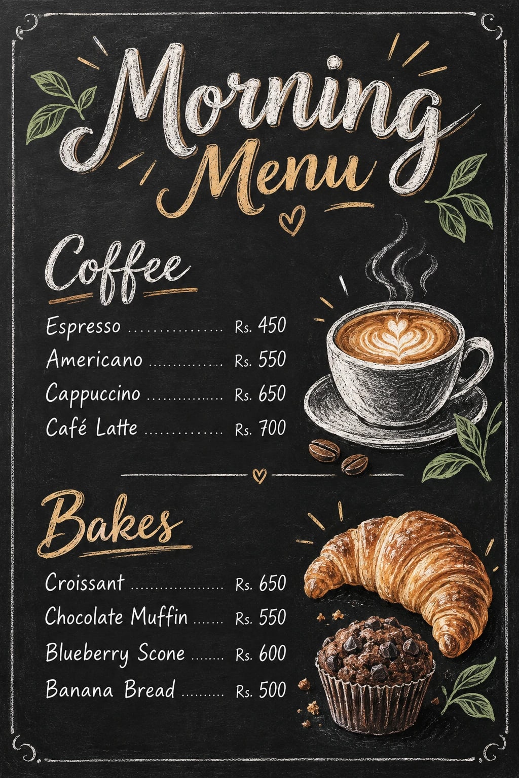
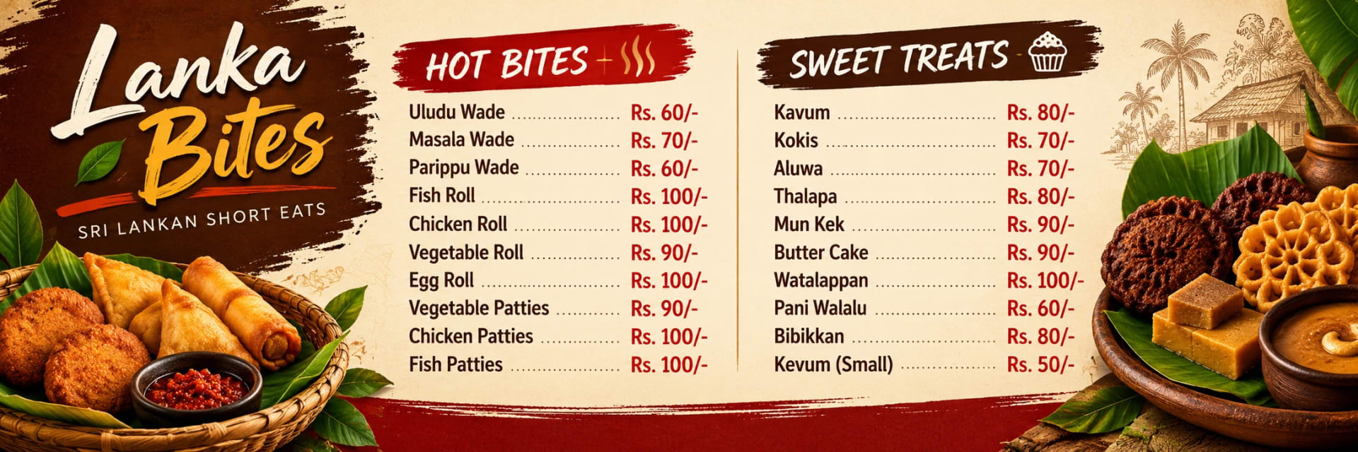
This prompt creates a practical short-eats menu with clean rows, clear pricing areas and warm food-inspired accents. A cream, dark brown and muted red palette gives the design a welcoming local-food feel, while simple typography keeps the menu easy to scan. The flat print layout avoids perspective distortion, and restrained illustration shading helps decorative food elements support the layout without making it feel crowded. The 3:1 format works well for wide menu boards, so review the crop carefully if you plan to use another aspect ratio.
Tips for the best result
Replace all placeholder text with the final menu items and prices before using the prompt.
Keep item names and prices in a separate checked list so nothing is missed.
Supply the exact Sinhala or English wording you want to appear.
Proofread Sinhala script carefully before printing, especially smaller text.
If very small lettering becomes unclear, add it later in a design editor.
Keep the row spacing consistent so customers can quickly match each item with its price.
Review the first result for spelling, alignment, readable prices and clean edges before using it.
Variations to try
Try a green-and-white palette with one clear central heading.
Use a slightly darker brown header with cream menu rows for stronger contrast.
Keep the same structure but reduce decorative food graphics for a more minimal menu.
Change one instruction at a time so you can clearly compare how the palette, typography or spacing affects the design.
Where to use it
This concept works well for bakeries, local snack shops, cafés, takeaway counters and short-eats displays. Keep a high-resolution uncropped master and create separate exports for print, digital screens or social media. Review item names, prices and row spacing at the final display size to make sure the menu remains clear and easy to read.