About this prompt
What this prompt creates
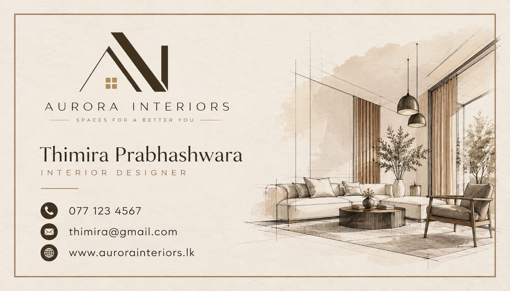
This prompt creates a restrained professional business card with warm neutral tones and subtle architectural linework. Sand beige, dark brown and warm white give the design a refined, understated feel, while clean readable typography keeps the information clear. A matte paper impression, fine consistent strokes and flat artwork help the card feel elegant and print-focused without unnecessary perspective effects. The 7:4 composition works well for business-card layouts, so review the crop before switching to another format.
Tips for the best result
Upload a high-resolution logo or transparent brand asset if available.
Provide the exact business name, job title, phone number, email and other contact details separately.
Keep the contact information short so the layout remains clean and balanced.
If the architectural linework becomes too faint at card size, ask for slightly thicker strokes.
If the card has front and back sides, clearly specify what information should appear on each side.
Check the first result carefully for logo accuracy, typography, alignment, line quality and any unwanted elements.
Variations to try
Try a white card with muted olive accents while keeping the same restrained layout.
Use a slightly darker beige background for a warmer, more premium look.
Keep the same palette but simplify the architectural motif for a more minimal result.
Change one instruction at a time so you can clearly compare how the palette, linework or typography affects the design.
Where to use it
This concept works well for interior design studios, architecture practices, property professionals and business networking. Keep an uncropped master version and create separate exports for print and digital sharing. Review small lettering, contact details and fine architectural lines at the final card size, since a good thumbnail does not always guarantee that every detail is fully usable.