Skip to content
Creative
Tattoo Studio Black Copper Business Card – AI photo made with ChatGPTMade with ChatGPT

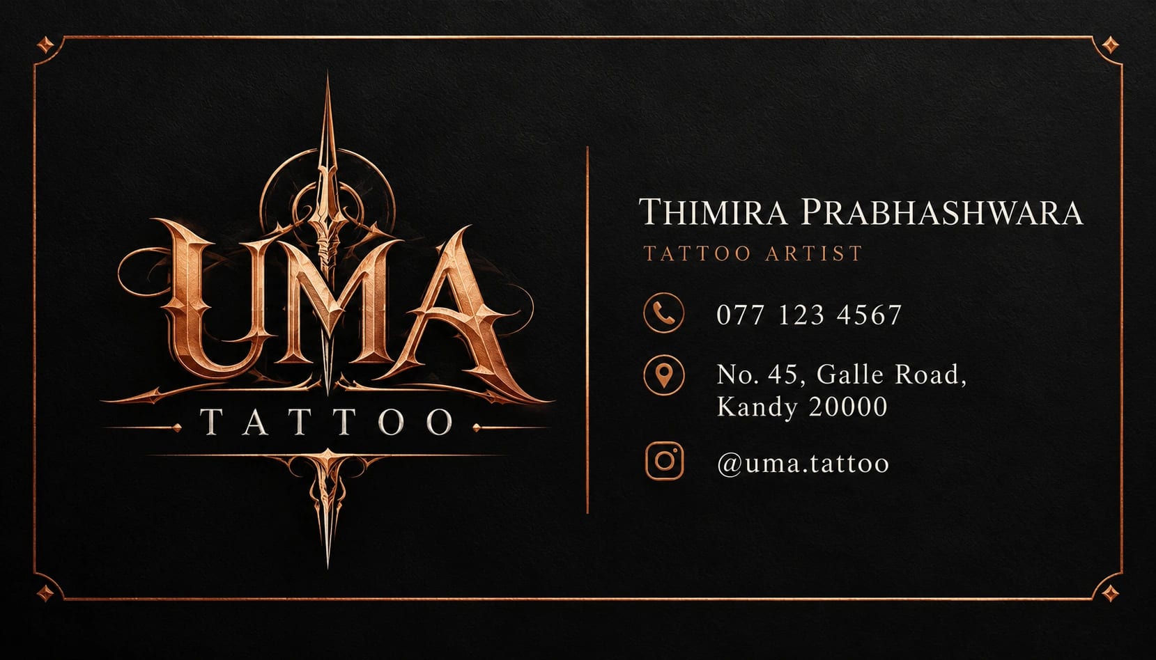
Tattoo Studio Black Copper Business Card

A bold tattoo-studio business card with black stock and copper accents.

PROMPT

Use my supplied logo and brand assets as the only brand references. Preserve the exact logo geometry, lettering, proportions, spacing and supplied colours. Use only the contact information and business wording that I provide. Do not invent a new logo or modify the supplied mark. Create an ultra-realistic high-quality photographic image in a landscape 7:4 aspect ratio, following this specific concept: Tattoo Studio Black Copper Business Card. Composition and Pose Show one flat front card design in landscape orientation, with [STUDIO NAME] and a supplied logo on the left. Put [ARTIST NAME], [PHONE], [ADDRESS] and [SOCIAL HANDLE] in a compact aligned block on the right. Add a thin copper rule, keeping all information safely inside the trim area. Clothing, Materials and Styling Matte black background, muted copper linework and readable off-white typography. Background and Lighting Flat print-design presentation with no card-stack perspective or fake embossing. Brand Preservation — Highest Priority Keep the supplied logo immediately recognisable and preserve every letter, symbol, proportion and relative spacing. Apply perspective or material effects only as needed for the specified surface. Use the approved logo variant for that surface. Keep contact information exactly as supplied. Do not introduce competing marks, fabricated business details or an unverified QR code. Maintain a clear hierarchy and leave adequate margin around the logo. Quality and Finish Maintain clear focal separation, natural scale, correct perspective and consistent illumination throughout the image. Keep anatomy and object construction believable. Render the main subject sharply while allowing only the intended background softness. Preserve subtle detail rather than using excessive sharpening or heavy smoothing. Make the overall visual feel cohesive, carefully composed and suitable for the stated use. Avoid: distorted objects, invented branding, altered labels, misspelled supplied copy, unreadable main text, cluttered composition, unrealistic reflections, floating contact shadows, watermarks and unrelated props. Keep only the text and people explicitly requested in this composition.

Works withChatGPTGeminiMidjourneyFlux

How to use

  1. 1Open ChatGPT or Gemini and upload your photo.
  2. 2Paste the prompt and send it.
  3. 3Not quite right? Ask for small changes, like “warmer light”.

Get new prompts on WhatsApp

New tested prompts every week, straight to your phone.

Join (opens in a new tab)

How to use

  1. 1Open ChatGPT or Gemini and upload your photo.
  2. 2Paste the prompt and send it.
  3. 3Not quite right? Ask for small changes, like “warmer light”.

Get new prompts on WhatsApp

New tested prompts every week, straight to your phone.

Join (opens in a new tab)

About this prompt

What this prompt creates

This prompt creates a bold tattoo-studio business card with a strong black-and-copper visual identity. A matte black background, muted copper linework and readable off-white typography give the design a premium, professional feel. The flat print-design presentation keeps the card clean and realistic without unnecessary card-stack perspective, fake embossing or overly glossy effects. The 7:4 composition works well for business-card layouts, so review the crop before switching to another format.

Tips for the best result

  • Upload the clearest available logo or brand asset, preferably as a transparent PNG.

  • Provide the exact name, phone number, social handles and other contact details separately.

  • If the design has front and back sides, clearly identify which information belongs on each side.

  • Keep tiny text to a minimum so the card remains readable when printed.

  • Typeset very small contact details manually in a design editor before sending the final card to print.

  • Check the first result carefully for logo accuracy, text alignment, clean edges and any unwanted elements.

Variations to try

  • Try a pale bone background with black linework for a lighter studio identity.

  • Use a deeper copper accent with more negative space for a more premium look.

  • Keep the black background but simplify the linework for a cleaner minimalist version.

  • Change one instruction at a time so you can clearly compare how the background, palette or graphic styling affects the design.

Where to use it

This concept works well for tattoo artists, studio networking, appointment cards and professional brand identity materials. Keep an uncropped master version and create separate exports for print, social media or digital sharing. Review small lettering, contact details and fine linework at the final print size, since a good thumbnail does not always guarantee that every detail is fully usable.