About this prompt
What this prompt creates
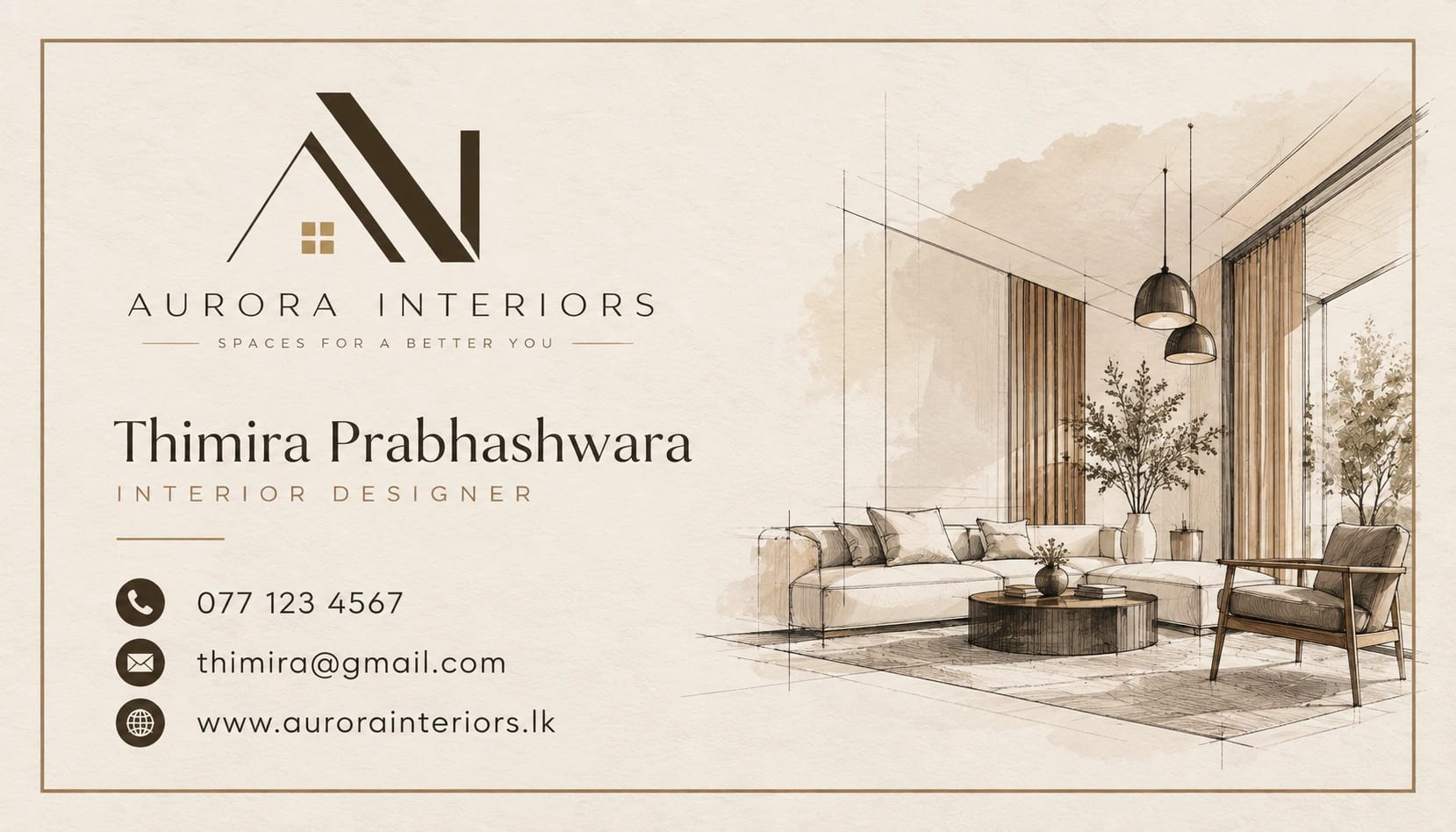
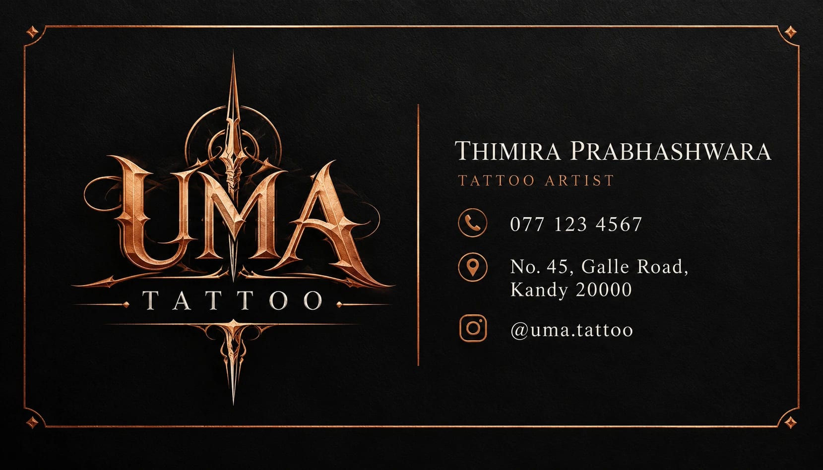
This prompt produces a realistic product mockup of a minimal visiting card, showing both sides on a stone surface with soft daylight shadows. It is ideal for seeing how a design will feel in real life before paying for printing. The layout uses lots of white space and only a few lines of text, which is the style many designers, architects and consultants prefer.
Tips for the best result
- Use a real email only if you are happy for it to appear in images; example.com is safer for tests.
- If the logo looks messy, ask for “a very simple geometric logo made of three lines”.
- Upload your own logo as an image and ask the model to place it exactly as given.
- Before sending a design to a printer, check that the smallest text is still easy to read in the mockup; tiny contact details are the most common problem on minimal cards.
Variations to try
- Switch to thick black cards with white text for a bold, premium look.
- Place the cards on a wooden desk next to a notebook and pen.
- Ask for a close-up angle showing the card edge and paper texture.