Skip to content
Podcast
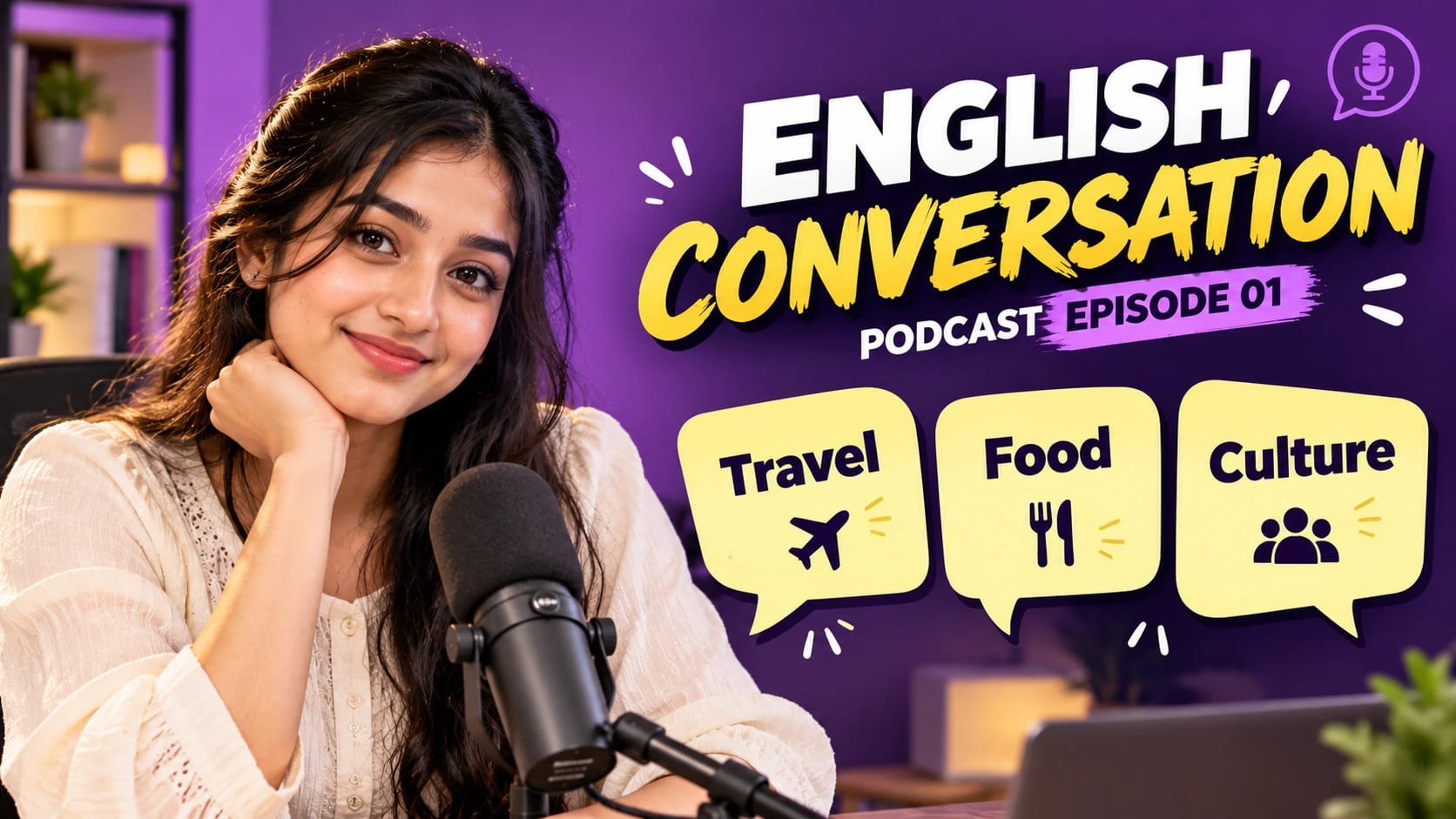
Language Learning Podcast Thumbnail – AI photo made with ChatGPTMade with ChatGPT

Language Learning Podcast Thumbnail

A friendly podcast cover with a host and simple language-card graphics.

PROMPT

Use my uploaded photo/photo(s) as the only identity reference for the person. Preserve the real face, age, skin tone, hairstyle, body build, facial proportions and unique identifying features with the highest possible accuracy. Create a polished visual design in a landscape 16:9 aspect ratio, following this specific concept: Language Learning Podcast Thumbnail. Composition and Pose Show the uploaded host on the left in a chest-up view, smiling gently toward the camera. Put a microphone below chin level without covering the face. On the right, place three simple speech cards with [WORD 1], [WORD 2] and [WORD 3], plus [EPISODE TITLE] at the top. Clothing, Materials and Styling A soft cream blouse, violet background and pale yellow cards. Background and Lighting Bright studio-style lighting, clean graphic contrast and realistic microphone materials. Identity Preservation — Highest Priority Every face must remain immediately recognisable as the same person in the uploaded reference. Accurately preserve: - Exact face shape, forehead, hairline and facial proportions - Eyebrows, eye shape, eyelids, eye spacing and gaze direction - Nose shape, lips, cheeks, ears, jawline and chin - Facial hair, freckles, moles and other distinguishing details - Real age, skin tone, body build and natural asymmetry - Realistic skin texture and individual identity Do not beautify, reshape, slim, widen, age, de-age, blend, replace or reinterpret a face. Do not mix features between subjects or use generic model faces. Preserve the original hairstyle and hair texture. Keep any makeup subtle and consistent with the real features. In group scenes, maintain the correct count, reference-to-person mapping and believable height relationships. Quality and Finish Maintain clear focal separation, natural scale, correct perspective and consistent illumination throughout the image. Keep anatomy and object construction believable. Render the main subject sharply while allowing only the intended background softness. Preserve subtle detail rather than using excessive sharpening or heavy smoothing. Make the overall visual feel cohesive, carefully composed and suitable for the stated use. Avoid: extra people, extra limbs, missing fingers, fused hands, impossible joints, facial mismatch, covered eyes, blurry faces, exaggerated expressions, plastic skin, busy foregrounds, watermarks and unwanted text. Keep only the text and people explicitly requested in this composition.

Works withChatGPTGeminiMidjourneyFlux

How to use

  1. 1Open ChatGPT or Gemini and upload a clear photo of yourself.
  2. 2Paste the prompt and send it.
  3. 3Not quite right? Ask for small changes, like “warmer light”.

Get new prompts on WhatsApp

New tested prompts every week, straight to your phone.

Join (opens in a new tab)

How to use

  1. 1Open ChatGPT or Gemini and upload a clear photo of yourself.
  2. 2Paste the prompt and send it.
  3. 3Not quite right? Ask for small changes, like “warmer light”.

Get new prompts on WhatsApp

New tested prompts every week, straight to your phone.

Join (opens in a new tab)

About this prompt

What this prompt creates

This prompt creates a friendly podcast cover featuring a host alongside simple language-learning card graphics. A soft cream blouse, violet background and pale yellow cards give the design a warm, approachable educational look. Bright studio-style lighting keeps the host clear, while crisp graphic contrast and realistic microphone materials help the cover feel polished without becoming visually busy. The 16:9 composition works especially well for video podcast covers and episode thumbnails, so review the crop before switching to another format.

Tips for the best result

  • Use a sharp, evenly lit reference photo that clearly shows the full face and hairline.

  • Avoid using a heavily filtered image as the only identity reference.

  • Keep vocabulary cards limited to short words or very brief phrases.

  • Double-check the spelling of every word before generation.

  • Use fewer cards if the episode title or host begins to feel crowded.

  • Keep the microphone slightly away from the face so important facial details remain visible.

  • Check the first result carefully for face accuracy, readable card text, microphone detail and unwanted elements.

Variations to try

  • Try a two-host version using separately labelled identity references and one clear episode title.

  • Replace the violet background with soft blue while keeping the pale yellow vocabulary cards.

  • Use one larger vocabulary card instead of several smaller cards for a cleaner cover.

  • Change one instruction at a time so you can clearly compare how the layout, palette or graphic styling affects the result.

Where to use it

This concept works well for language podcasts, educational clips, beginner lessons and learning-channel covers. Keep an uncropped master version and create separate exports for YouTube, podcast video platforms or social media. Review the episode title, vocabulary cards and facial details at actual display size, since a design that looks clear when enlarged may become harder to read on mobile.